Showing posts with label Nike. Show all posts
Showing posts with label Nike. Show all posts
July 1, 2010
May 20, 2010
New Nike World Cup Commercial
Deadspin called it meta-referential. Why else would they include Kobe Bryant and Roger Federer? I'd say that applies, as does hyperbolic.
The following is a result of Nike's tireless effort to make the grandest statements in their commercials. Though, in the case of an England victory in the World Cup, I dare say you'd see plenty of Wayne-babies in England in the coming months. So, perhaps that's not an exaggeration. One mistake that's made, however, is the inclusion of Brazilian star Ronaldinho, who did not make Brazil's World Cup roster.
In the end, Nike just doing it like only they can.
April 8, 2010
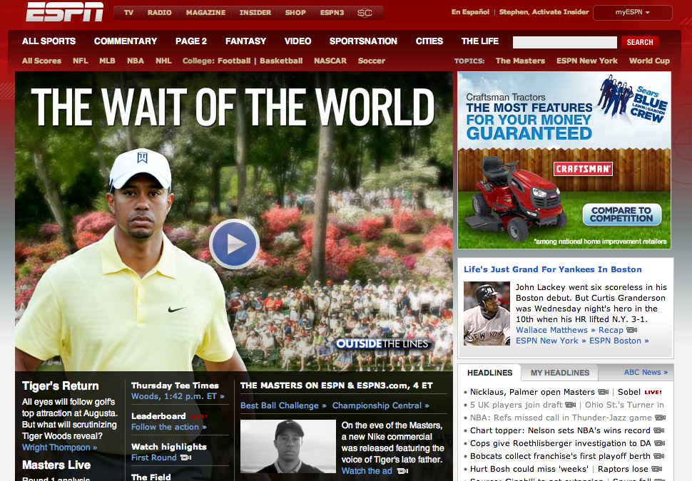
So, something is going on with Tiger Woods today
I've kind of kept Tiger Woods out of this blog thus far, with just one post addressing his privacy issues, but today the world's greatest golfer will simply not be ignored. With a 1:42pm tee-off time at Augusta National, in the first golf major of the year, Tiger makes his return to competitive golf. And, as usual, the media is all over it (ESPN, covering the Masters live on the network for the first time, must be counting their lucky stars).

But even if all of this media hoopla isn't enough, Nike and Tiger Woods went ahead and upped the ante by releasing a new commercial featuring the voice of Tiger's father, Earl Woods. In the spot, Tiger faces the camera while his late father narrates, among other things, "I want to find out what your thinking was, I want to find out what your feelings are, and did you learn anything?"
Wow. Nike always seems to know how to make an impact, but is this in bad taste? While it might work to help establish a discourse of sympathy by having Tiger just stare at the camera without saying anything, is it right to play, as some have called, the Dad card?
Obviously, it makes a lot of sense for Nike to help rehabilitate their most prized asset. And to folks who say, "this doesn't make me want to run out and buy a Nike product," well, how many Nike commercials actually do that? Many of their ads are personality driven concept ads, like this Lance Armstrong "Magnet" spot, or this Briscoe High football ad, or this crazy Masks ad, or this infant Troy Polamalu and LaDainian Tomlinson ad. I could go on and on. Is it less ethical than this...?
Anyway, what do we make of this ad? Is it simply part of the Tiger rehabilitation project? Is it in bad taste? Whose idea was it? Why is it in black and white? What is with the newsreel cut-type style at the very end of the ad? And where did they get that Earl Woods audio?
March 4, 2010
Channeling Our Sports Miracles, or...
"Sport That: Jerseys For Make Benefit the Glorious Nation of the United States."
Over the past couple of weeks, we've seen plenty of team USA uniforms. Some good, some bad, some whatever. But I am most interested, specifically, in how a new set of team USA jerseys for our men's national hockey and soccer teams are channeling our sports histories. Both teams released new jerseys for the events of 2010: the hockey team for the Vancouver Olympics and the soccer team for the World Cup. More importantly, both jerseys call on our nation's sports histories and focus on a few of its most dramatic moments.
Let's begin with the hockey team, who recently finished second at the the Vancouver Games' Olympic hockey tournament. A thrilling tournament from start to finish, the players from the USA wore the following series of hockey jerseys, designed by Nike, for the first time in Vancouver.


Nike designed the jerseys with a retro feel to channel those worn in both the 1960 Squaw Valley Olympics as well as the 1980 Lake Placid Olympics. Both of those hockey teams, of course, won gold. Let's see how they compare.


Some elements are different, like the shade of blue and the color of the letters, but there are a host of similar elements too: the USA is similarly arched, there are stars on the shoulders, and a red stripe at the bottom of the jersey.
The same "retro feel" phenomenon accurately describes the jerseys debuted yesterday by the US men's soccer team. In a friendly defeat against the Netherlands, the US presented their 1950-World Cup-inspired shirts, featuring a diagonal stripe from right shoulder to left hip.


In sum, my curiosity lies with this national team retro trend and how it embeds current jersey iterations with the hauntings of glorious sports victories past. Because while, for years, retro jerseys have proliferated throughout sports culture, this seems to be unique - in that these current shirts have something special to them. It could be weight, in the form of expectation, that delivers an extra sense of pressure when competing for your country. Or, in the case of traditional underdogs in hockey and soccer, could it be that these jerseys are designed to remind our national athletes of the possibility of accomplishment? Could it be a reminder of others that have gone before them and overcame the odds?

Even if these jerseys are nothing more than shirts, if they teams can win (and hockey just missed out), they will surely make benefit at least one group: the glorious corporation of Nike. Both retro jerseys were designed and produced by the Beaverton, Oregon sports manufacturer and, as such, both jerseys have one glaring foreign element, an almost alien presence among the retro ambience: the ubiquitous Nike Swoosh.
Over the past couple of weeks, we've seen plenty of team USA uniforms. Some good, some bad, some whatever. But I am most interested, specifically, in how a new set of team USA jerseys for our men's national hockey and soccer teams are channeling our sports histories. Both teams released new jerseys for the events of 2010: the hockey team for the Vancouver Olympics and the soccer team for the World Cup. More importantly, both jerseys call on our nation's sports histories and focus on a few of its most dramatic moments.
Let's begin with the hockey team, who recently finished second at the the Vancouver Games' Olympic hockey tournament. A thrilling tournament from start to finish, the players from the USA wore the following series of hockey jerseys, designed by Nike, for the first time in Vancouver.


These offerings replaced the uninspiring U.S. jerseys
worn in the past couple Olympic tournaments.

The gold-winning 1960 Squaw Valley team was picked to finish 5th.
Some call their victory "The Forgotten Miracle."
Interestingly, Herb Brooks got cut from this team during tryouts.

In 2010, during the preliminary round victory against Canada.
Very similar design elements, from the diagonal block shadow letters to the crest on the upper left shoulder. The striping also matches. These jerseys are pretty close. Let's check the jerseys from 1980.

The 1980 team was backstopped by Jim Craig.

So, naturally, the media played on the connections to
current US goaltender Ryan Miller.
The same "retro feel" phenomenon accurately describes the jerseys debuted yesterday by the US men's soccer team. In a friendly defeat against the Netherlands, the US presented their 1950-World Cup-inspired shirts, featuring a diagonal stripe from right shoulder to left hip.

The US squad before their underwhelming performance against the Dutch.

The 1950 US squad. Their victory over England is, unfortunately,
known today as the "Miracle on Grass."
known today as the "Miracle on Grass."

The sash in color.
While it seems almost sash-like, the jersey's diagonal element has a purpose. It was lifted from the jerseys of the 1950 team that beat England 1-0 in a group stage match. Just the fourth World Cup ever, the tournament was hosted by Brazil and won by Uruguay. The US did not progress past the group stage, but their victory over the perennial football power has reverberated throughout history, both at home and abroad. Coincidentally (or not), in this summer's World Cup, the US will once again face favorites England in the group stage of the tournament.
In sum, my curiosity lies with this national team retro trend and how it embeds current jersey iterations with the hauntings of glorious sports victories past. Because while, for years, retro jerseys have proliferated throughout sports culture, this seems to be unique - in that these current shirts have something special to them. It could be weight, in the form of expectation, that delivers an extra sense of pressure when competing for your country. Or, in the case of traditional underdogs in hockey and soccer, could it be that these jerseys are designed to remind our national athletes of the possibility of accomplishment? Could it be a reminder of others that have gone before them and overcame the odds?

Seems strange to channel the past without a red stripe. Hooray revisionism!
Even if these jerseys are nothing more than shirts, if they teams can win (and hockey just missed out), they will surely make benefit at least one group: the glorious corporation of Nike. Both retro jerseys were designed and produced by the Beaverton, Oregon sports manufacturer and, as such, both jerseys have one glaring foreign element, an almost alien presence among the retro ambience: the ubiquitous Nike Swoosh.
November 24, 2009
An Opposition to 'Combat'
A couple of posts ago, I paid some attention to Nike's Pro Combat Uniforms, noting the overwhelming militaristic sense of the name "Combat" especially in regards to the truck on Virginia Tech's campus reading: "Prepare for Combat."

Now, it seems that I've overlooked Nike's plan to implement "Combat" uniforms in other sports. In this case, the notable example is with regards to basketball...specifically, Lebron James.
Over the past few years in the city of Cleveland, Nike has used ten stories of an office building near Quicken Loans Arena to display Lebron James murals/advertising. The most recent of these billboards features "Jesus" Lebron, arms spread wide with the tag line "We Are All Witnesses."

Just this week, Nike proposed a new advertisement for the space. As part of the "Combat" line of apparel, the new mural echoes the VT truck and implores us to "Prepare for Combat."

Yet the proposed billboard was rejected by the Cleveland Planning Commission because they believe the new billboard represents pure advertising while the current billboard is civic art. According to a Cleveland Plain Dealer article, CPC leaders not only thought Nike was "going over the line to market a Nike product," but were also dismayed by "the lack of a 'Cleveland' or 'Cavaliers' presence on the mural."
More importantly, however, commission Chairman Tony Coyne "said he felt the 'combat' reference is also inappropriate, at a time when U.S. soldiers are fighting in Afghanistan and Iraq."
It is interesting to see Nike's militarism recognized and rejected in Cleveland, but accepted and celebrated in Blacksburg, VA (and other college campuses around the nation). The truck seems so much more overt, and yet VT officials and students seemed to accept it so readily. Does this have more to do with the nature of the relationship between Nike and its affiliated universities? Can the truck be called 'civic art' in any way? I'm not sure, but I do see it as encouraging that Cleveland commissioners took a stand, for Cleveland and for the nature and idea of sport: a game and just a game.
November 14, 2009
The Sexiness of the Nike Swoosh...
I have to carry this idea of sexiness over from my earlier post. Instead, however, of discussing the issue of sex and female basketball players, something else from the photos on the FSU website caught my attention: namely, the prodigious placement of the Nike Swoosh.


In each shot, the basketball is an equal subject to the body. And, even though these basketballs also feature the FSU logo, it is the Nike Swoosh that is given prominence. Just another example of Nike's careful image management...which, also happens to marginalize the school in favor of the corporation.
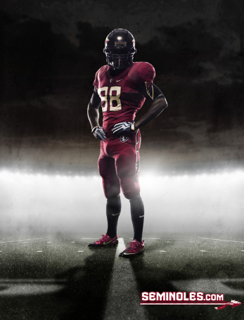
So, is this for us, the ticket-buying populace, or for future student-athletes, this affirmation of FSU's connection to Nike? That affirmation has made its presence known on FSU football, with the recent launch of the FSU Pro Combat jersey...

With nearly a dozen Nike Swoosh logos on the uniform above, and with the logo invading every part of student-athlete promotion, will we ever reach Nike overkill? Or is it simply an accepted part of collegiate sport? Is it inevitable? It seems so, because...well...in the words of Horatio Sanz, "it's just too sexy!"


So, is this for us, the ticket-buying populace, or for future student-athletes, this affirmation of FSU's connection to Nike? That affirmation has made its presence known on FSU football, with the recent launch of the FSU Pro Combat jersey...
November 11, 2009
Veterans Day...
There is a great post over at The Agon that addresses, appropriately, the many connections between war, politics, and sport. I responded to Dr. Butterworth over there, but I wanted to bring my thoughts back here as well.
Considering that our culture has acquiesced to militarism, the idea is only strengthened by the desensitization furthered by the numerous commercial interests that subtly (and not so subtly) equate sport with war.
Notably - Nike, Under Armour - blend, all too easily, sport and war. As I mentioned yesterday, within the past few weeks, Nike has created the "Pro Combat" uniform for a number of its college football-affiliated schools.
Yesterday, I mentioned that Virginia Tech happens to be one of Nike's "Pro Combat" schools and, as a part of the product rollout/promotion, Nike dropped off a rather militaristic-looking truck into one of the University's main quads.
The imposing vehicle bears the words, "Prepare for Combat." (Against who?)
It is not only surprising considering our current wars abroad, but especially considering the hauntings of the tragedy that befell VT just a few years ago. But, it's their campus, I suppose. Is this a case of the administration simply bowing to Nike? Or, are students on-board with this...and perhaps their interpretations have put those events behind them?
Subscribe to:
Posts (Atom)